Elevating That's Amore with Bold & Engaging Design
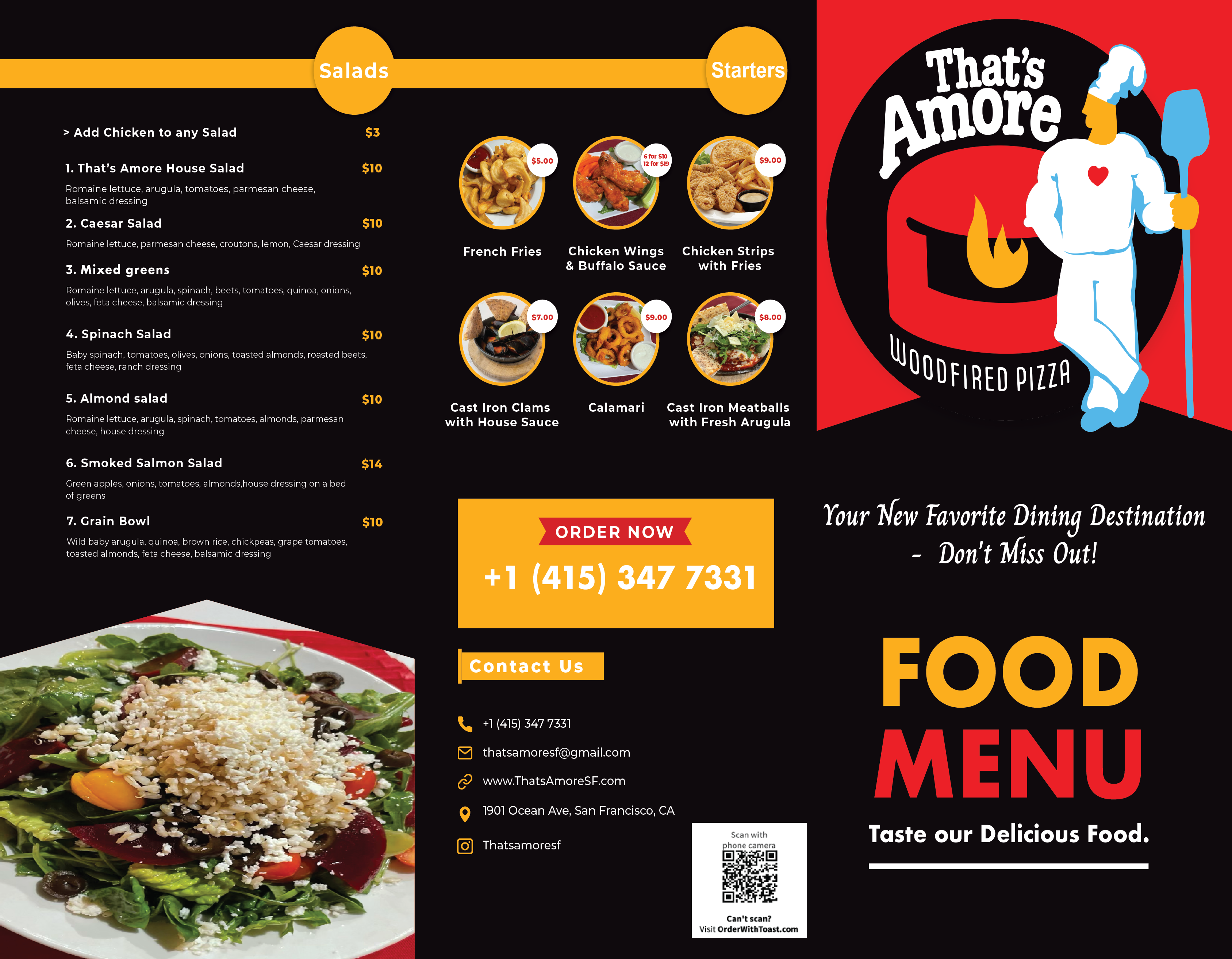
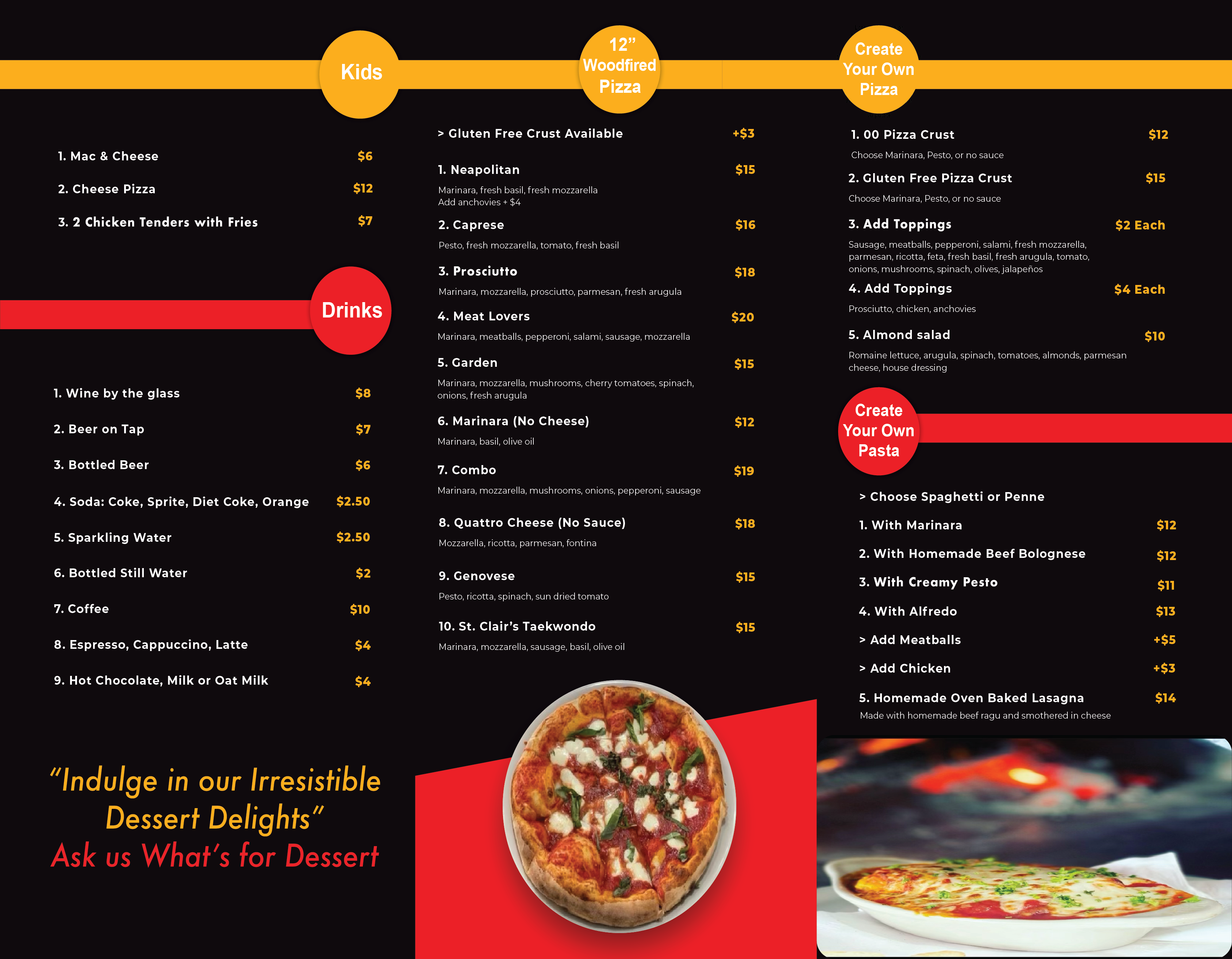
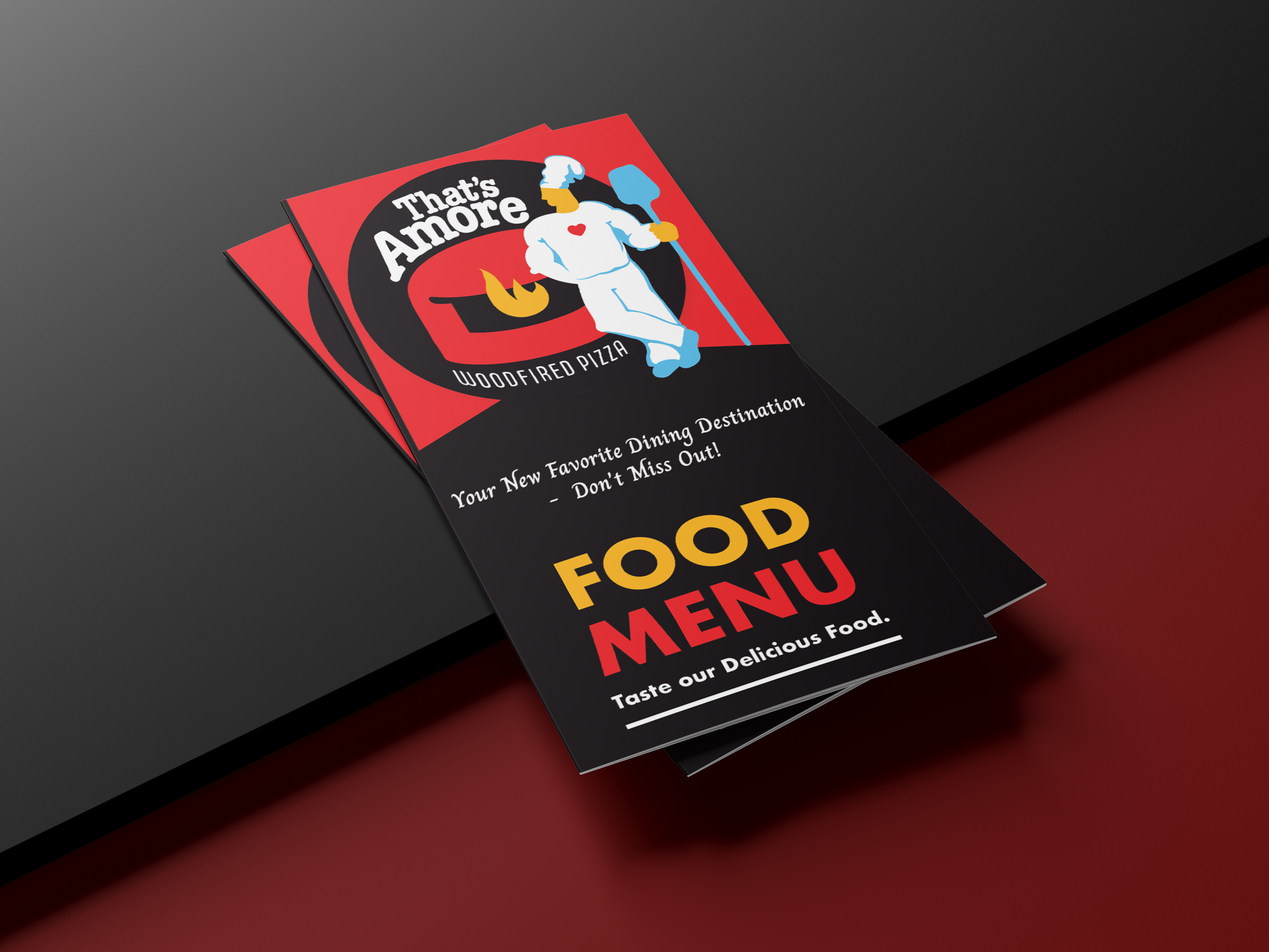
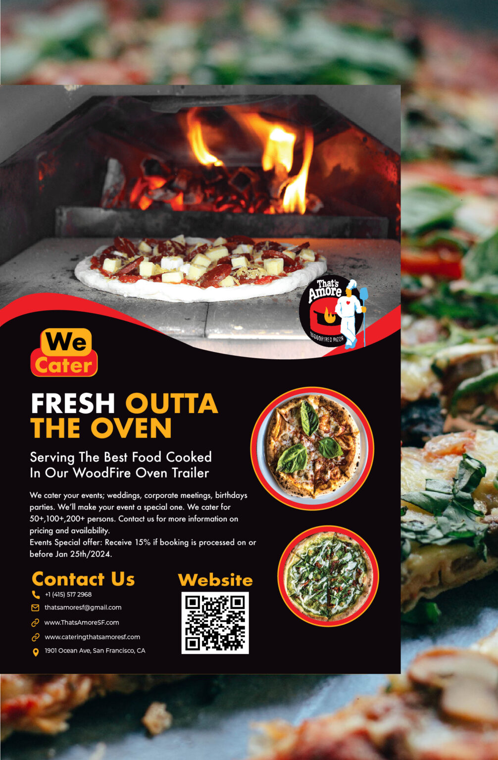
Nveil designed a sleek and visually compelling trifold menu for That’s Amore, ensuring a balance between aesthetics and functionality. The menu reflects the restaurant’s brand identity with a bold black background, striking red and gold accents, and easy-to-read typography. The structured layout enhances customer experience by organizing menu items in a clear and engaging way. Additionally, Nveil crafted a promotional flyer for the restaurant’s catering services, maintaining brand consistency and professionalism across all marketing materials. Both designs aim to elevate That’s Amore’s presence, making their offerings more appealing to customers while reinforcing their brand image.
• Custom Trifold Menu Design – A stylish, well-organized layout enhances readability and customer experience.
• Brand Identity Integration – Uses That’s Amore’s signature colors and aesthetic to create a cohesive look.
• Catering Flyer Design – A promotional piece that highlights the restaurant’s catering services in an eye-catching way.
• Professional & Engaging Presentation – Ensures a polished and inviting look across all materials.
• Marketing-Driven Approach – Designed to attract customers and boost the restaurant’s brand appeal.


