Zaytoon
Blending Heritage with Modernity: Zaytoon Logo Redesign
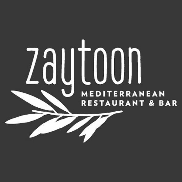
At Nveil, we partnered with Zaytoon Restaurant & Bar to redefine their brand identity, drawing inspiration from the Arabic word “Zaytoon,” meaning olives. Weaving a graceful olive branch into the logo design, we created a visual narrative that honors the restaurant’s cultural roots while embracing modern sophistication. Through meticulous attention to detail and a deep understanding of Zaytoon’s vision, we delivered a timeless logo that captures the heart of their culinary heritage and sets them apart in a competitive market.
Reflecting on the Past: The Need for Change
• The original logo lacked the cultural and modern flair needed for Zaytoon’s vision.
• Key areas for improvement identified: elegance, cultural representation, and versatility.
Standing Out: Competitive Analysis
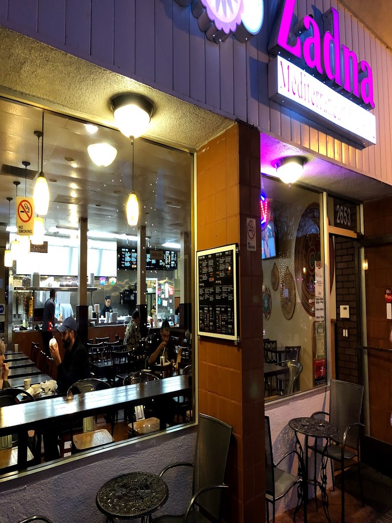
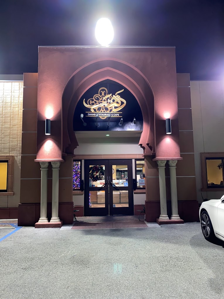
• Analyzed competitors to ensure Zaytoon stands out with a unique identity.
• Identified gaps in competitor branding to position Zaytoon as a leader in design and presentation.
Design Journey: From Concept to Completion
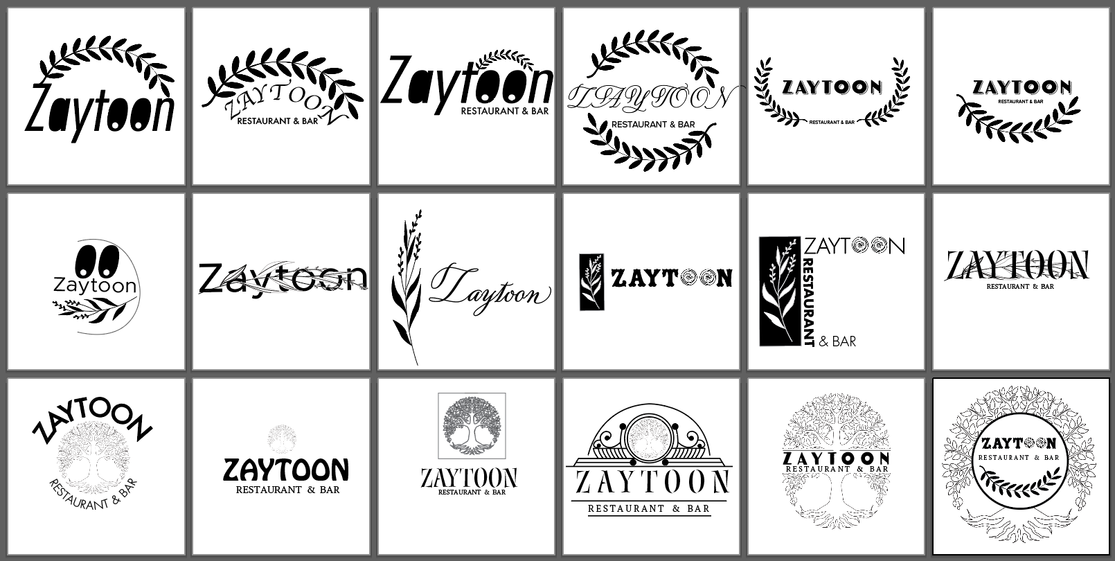
• Explored multiple iterations to strike the right balance of creativity and brand authenticity.
• Feedback-driven process ensured alignment with Zaytoon’s values and vision.
• Each iteration brought the design closer to the perfect representation of the brand.
Typography: The Backbone of Brand Identity
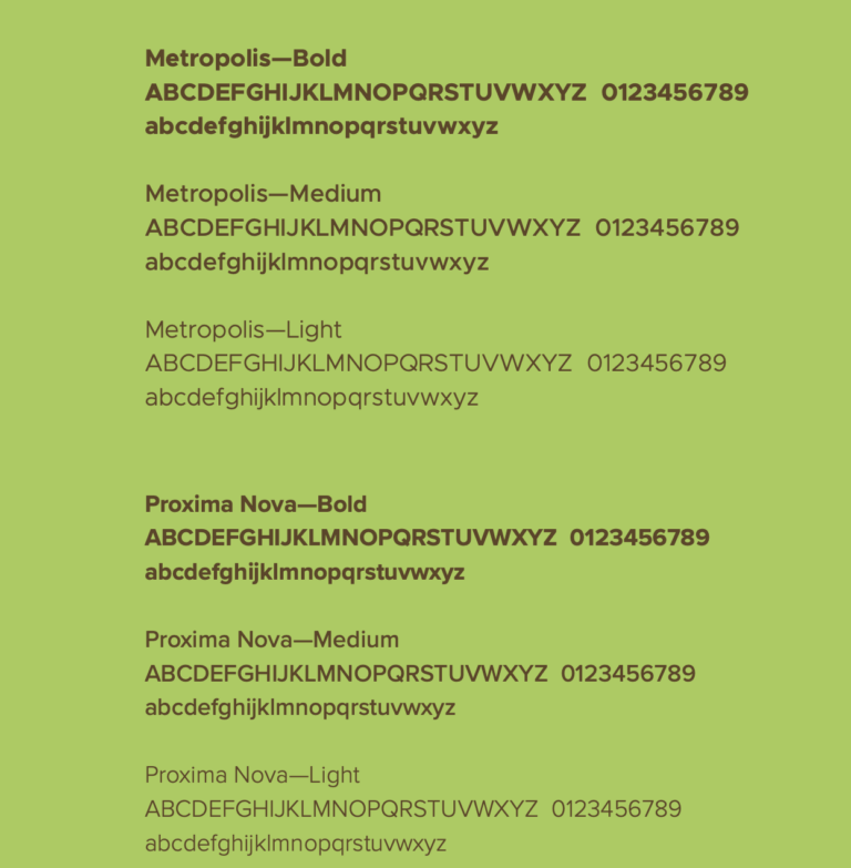
• Highlighted font selection process to align with the brand’s personality and aesthetic.
• Fonts chosen: Metropolis and Proxima Nova, combining modernity with readability.
• Deliberate use of varying weights to ensure versatility across different mediums.
Monochrome Versatility: Ensuring Clarity Everywhere
• Explored the logo in monochrome to ensure adaptability and clarity in all applications.
• Focused on maintaining the balance and elegance of the olive branch motif without compromising its impact.
• Simplified contrasts for optimal use in print and minimalist designs.
Color Evolution: Crafting the Perfect Palette
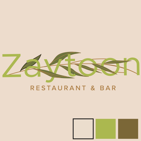
• A detailed exploration of color schemes that reflect the brand’s essence.
• Incorporated olive-inspired tones for authenticity and sophistication.
• Iterative process refined the logo to balance tradition and a modern aesthetic.
The Final Touch: Zaytoon’s New Identity
• The finalized logo integrates thoughtful design and brand storytelling.
• The olive branch motif is seamlessly woven into the typography to reflect cultural heritage.
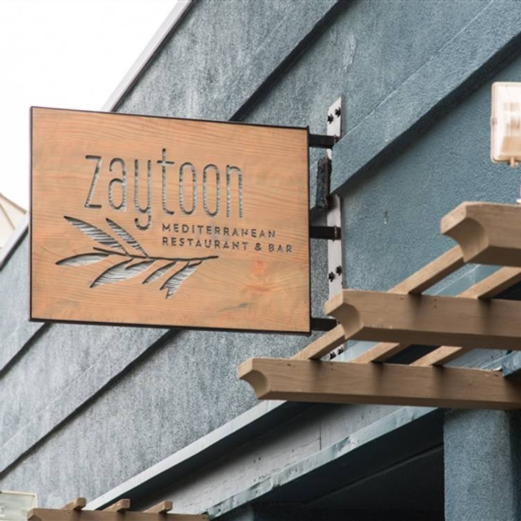
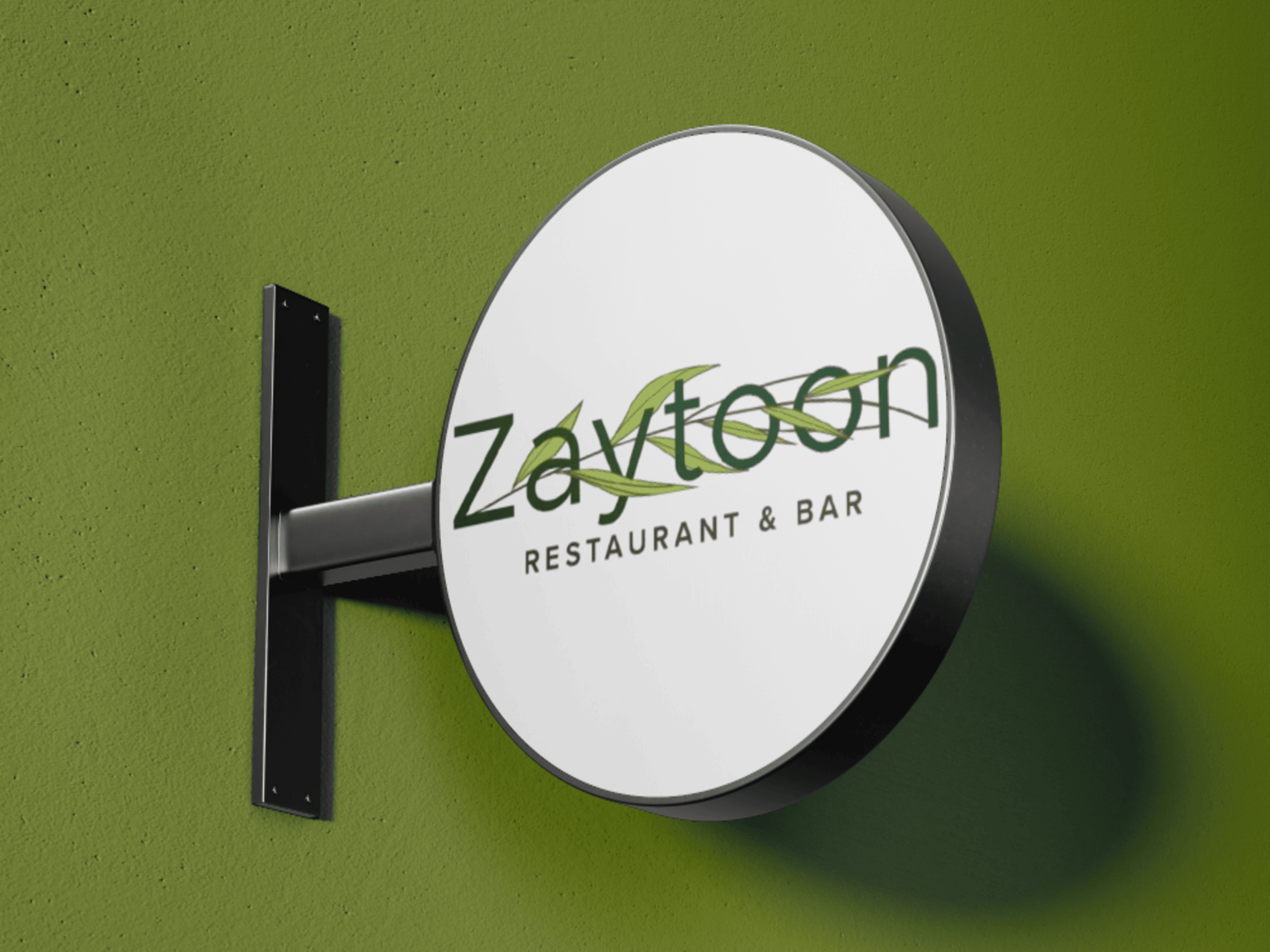
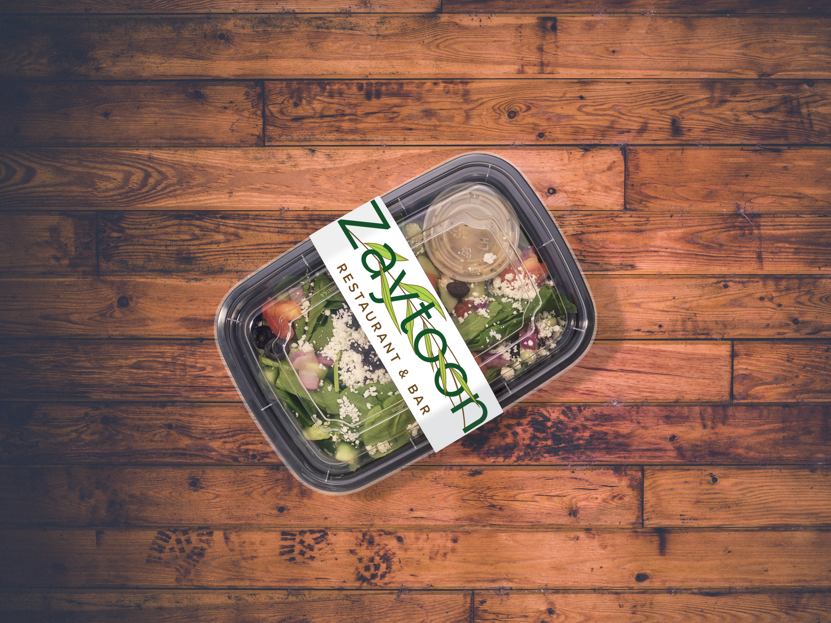
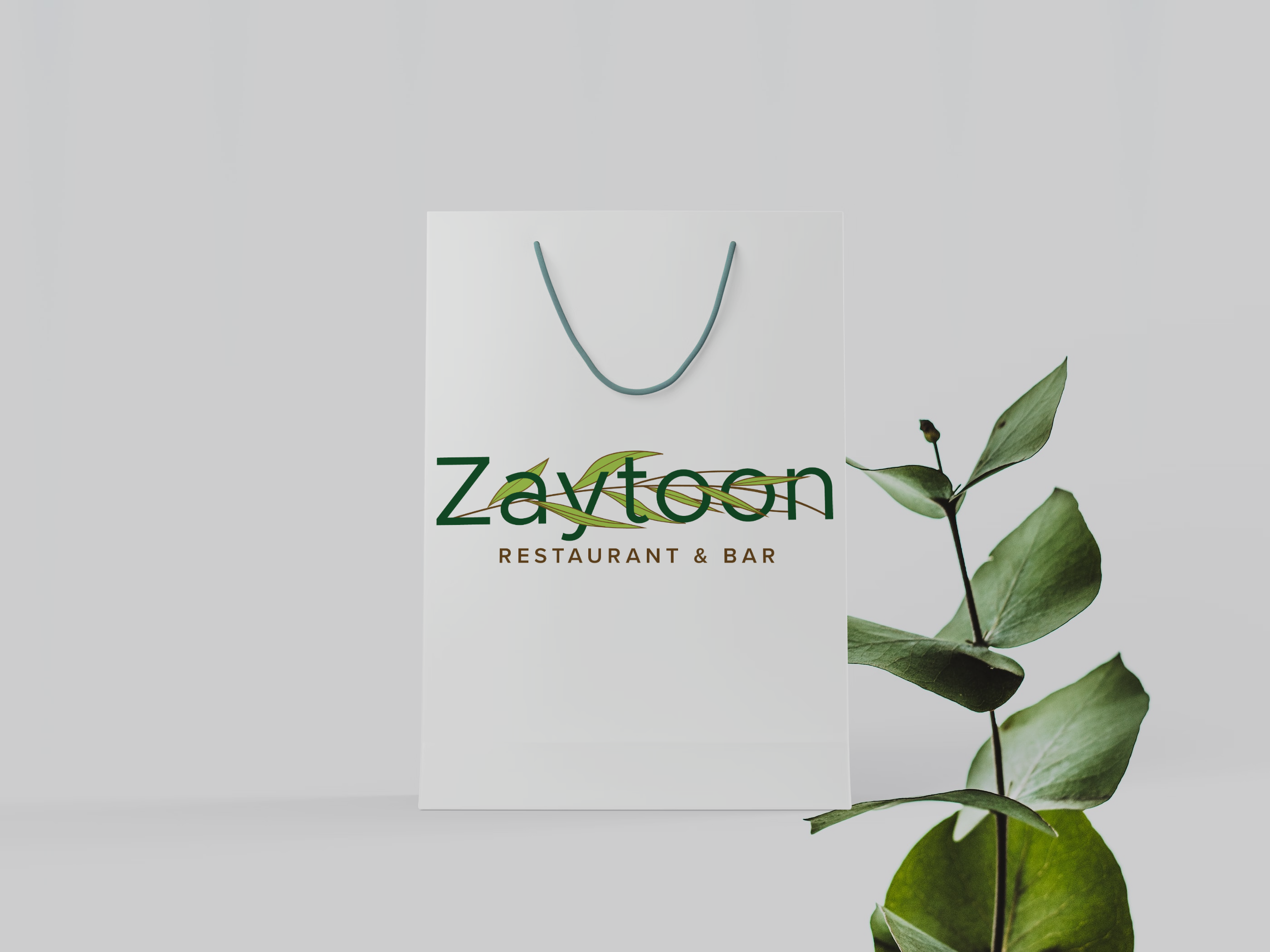
• Versatile for all applications, from signage to packaging.
Practical Perfection: Real-World Brand Integration
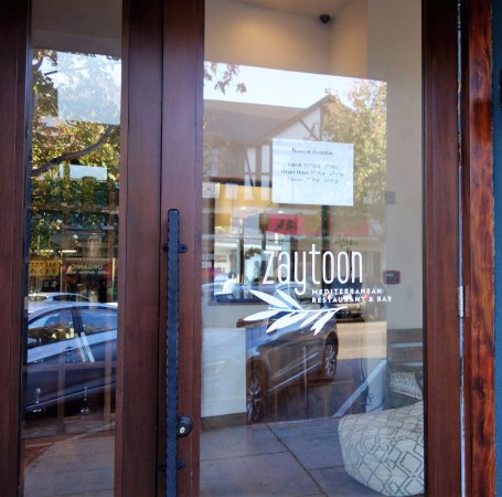
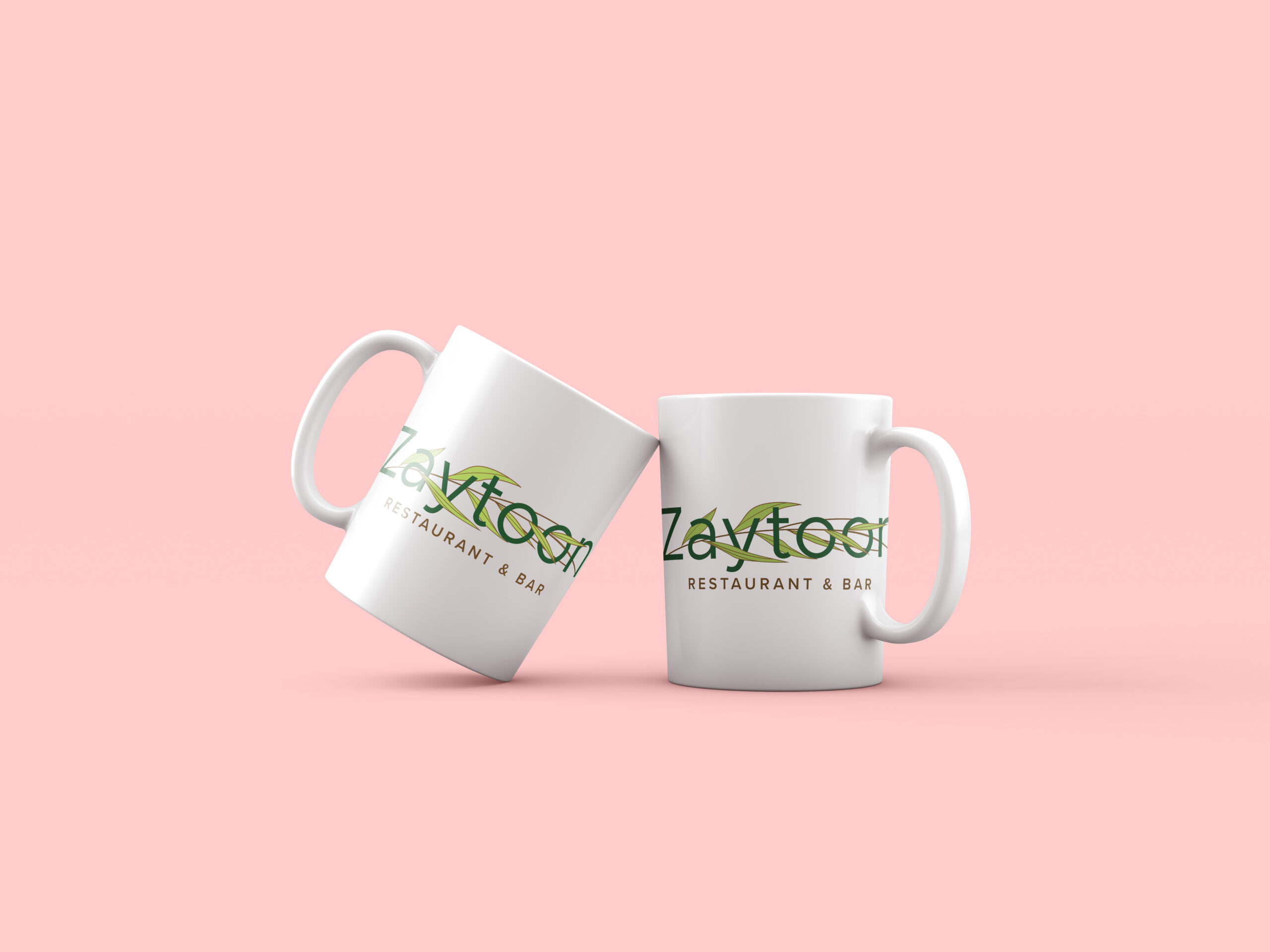
• Demonstrated versatility across real-world applications, including packaging, signage, and digital platforms.
• Each application reinforces the brand’s identity and elegance in customer-facing touchpoints.
• Crafted with precision to maintain consistency across various mediums.
